National University
National University Landing Pages

Our client National University is a nonprofit university educating students from all walks of life, through an extensive range of online and in-person degree programs. NU’s alumni community is over 200,000 strong, and last year they offered $50 million in student scholarships. With such a large range of programs, NU wanted to ensure their recruiting efforts were as impactful as possible.
Marketing Landing Pages
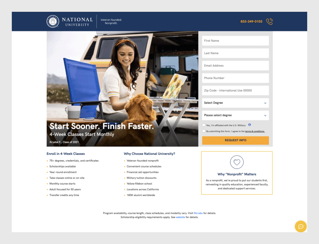
NU approached us with two projects: one, a revamped website, which you can read about here. In addition to the main site, National University also maintains a simple site just for marketing, designed to provide an easy way for prospective students to request information. All of the traffic to this site comes from paid marketing efforts: if a user searched Google for online education, they might see an ad for NU. If they clicked on the ad, instead of having to navigate through the main website, they would be presented with an easy way to take the next step in their educational journey: submitting the “Request Info” button. However, these landing pages weren’t producing as many requests for information as NU would have liked to see. They approached us about redesigning the landing pages for a better user experience, with the ultimate goal of maximizing conversions.

A/B Testing
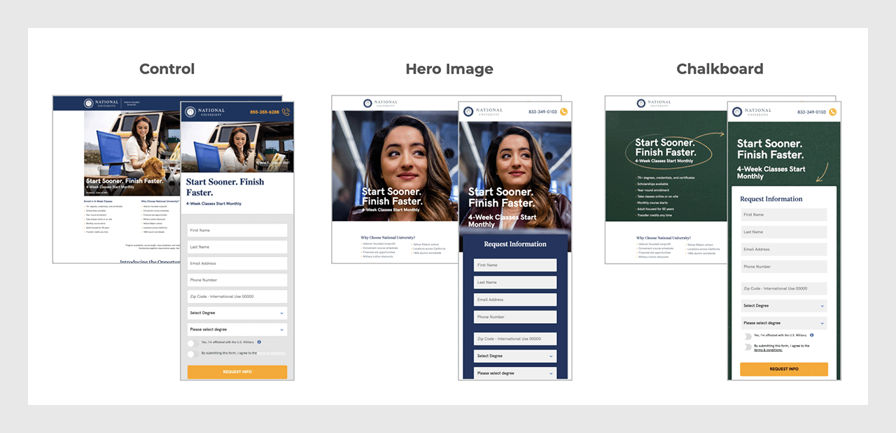
With the goal of increased RFIs in mind, we created two strong new designs. In order to learn which one would result in more requests for information, we went through a testing process. Some internet searchers saw the old version (Control), some saw New Design A: Hero Image, and some saw New Design B: the Chalkboard. Then, the team was able to measure the relative performance of all of the three different designs.

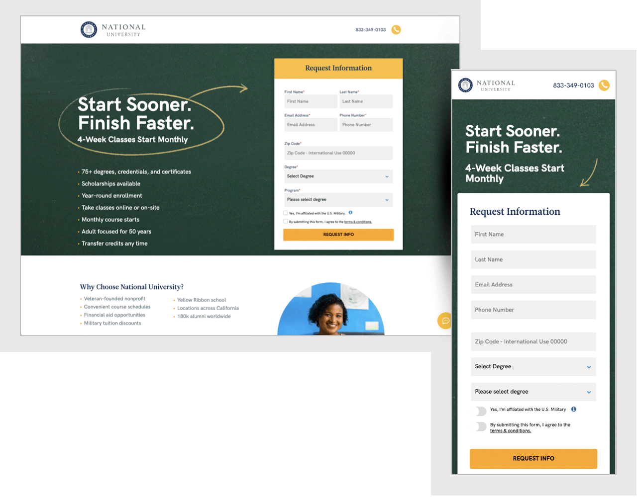
The results of the A/B testing were clear: The Chalkboard variation resulted in a 10% higher conversion rate in testing, resulting in an estimated 1,287 additional leads – per month.

Launch
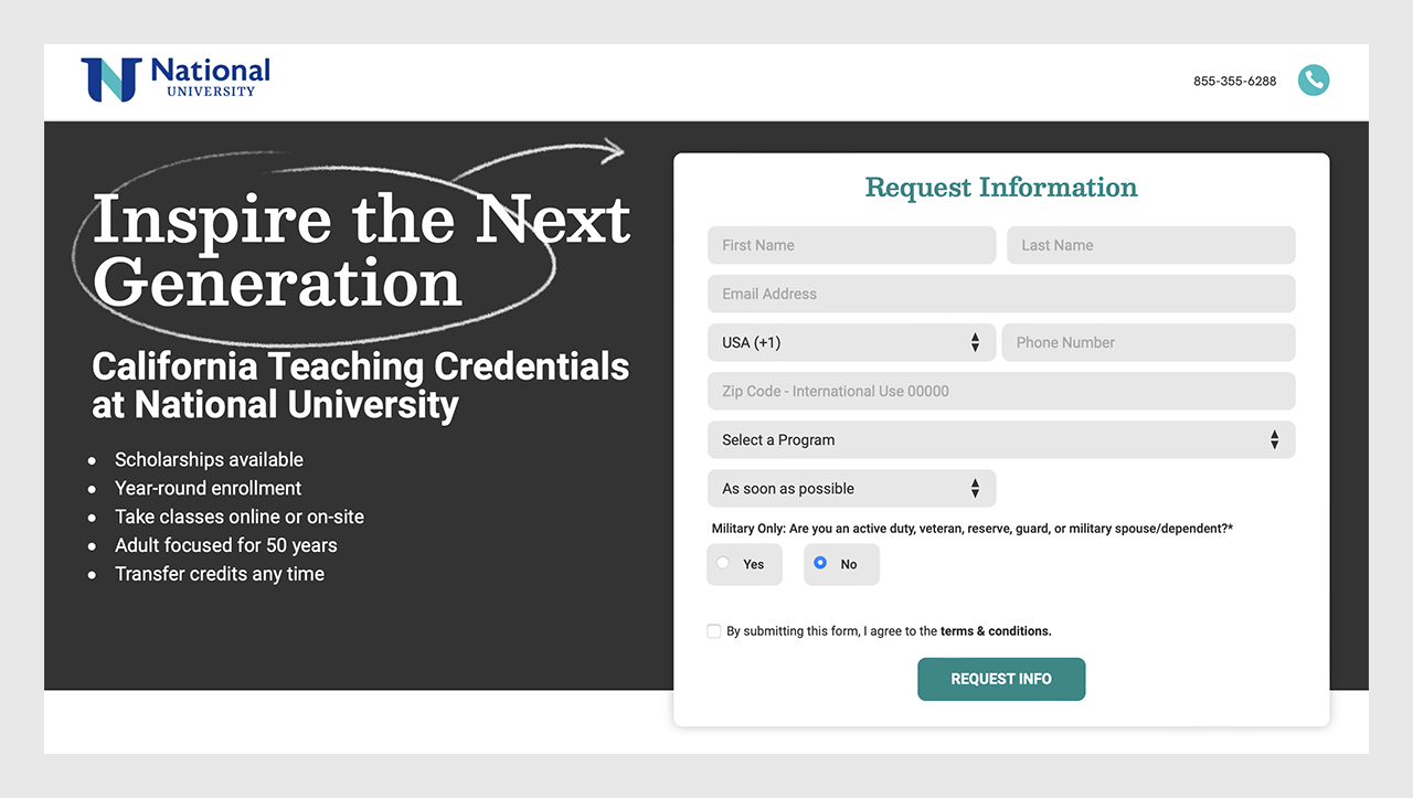
Next, we helped National University implement the new format across a wide variety of specific campaigns. For example, if a user in California searched for teaching credential programs, they might see a version of the chalkboard ad specific to NU’s teaching programs. We set up the new form as a template that was easy for the NU team to implement for many different campaigns: promoting specific degrees, specific programs, specific scholarship opportunities, and more.
We also helped coordinate the new landing pages with the main site, which was redesigned and launched around the same time. To make sure everything looked great together, we adjusted the chalkboard design to match the new branding.

Results
The new form system was rolled out on July 18, 2022. In the month that followed, requests for information submissions via paid marketing were up 22%. In other words, the new pages performed even better in real life than they did in the A/B test, and are in broad circulation today.